VIDEO
Katie Egeland (Senior Insights Analyst at PlayStation) will teach you to communicate in a way that resonates with your audience to drive action and influence decisions. Go beyond “what” and “how” questions to “why” and “who” – really think about who it’s for and why they want to see it.
Like what you see here? Our mission-aligned Girl Geek X partners are hiring!
- Check out open jobs at our trusted partner companies.
- Watch all ELEVATE 2023 conference video replays!
- Does your company want to sponsor a Girl Geek Dinner? Talk to us!
Sukrutha Bhadouria: Our next talk is gonna be given to us by Katie. Welcome Katie. Katie is a Senior Insights Analyst at Sony Interactive Entertainment. She’s a digital analyst focused on multi-platform customer behavior and insights. At PlayStation, she analyzes the customer journey across digital storefronts leads, A/B tests for digital merchandising and champions data-driven thinking across the organization. Welcome.
Katie Egeland: Thank you Sukrutha. Hi everyone. I’m Katie. And my talk today is about data storytelling and the skill that I think is most important in when you think about data storytelling and how it can really set you apart from from your peers. Before we get started, just a little about me. As mentioned, I am I work at Sony Interactive Entertainment, also known this PlayStation. I’ve been here for a little over five years, and I’ve worked on web analytics as well as commerce and customer journey analysis.
Katie Egeland: In addition to the video games, I also have worked in the international education and beverage industries, and I do enjoy gaming. Some of my, I hate picking favorite games, but some of my favorite game genres are action, adventure, term-based strategy. And I also enjoy any games that have plants in them. When we talk about data and data storytelling, you know, data’s everywhere these days and a lot of companies say, I wanna be data driven.
Katie Egeland: What does data driven really mean? It’s important to remember that just looking at numbers or having numbers doesn’t make you data driven. And as analysts, we often get asked for numbers, but those aren’t really the end goal. Nate Silver sums it up well here. He says, the numbers have no way of speaking for themselves. We speak for them, we imbue them with meaning, we being the analysts who are getting numbers and translating that to our stakeholders and businesses. But what kind of meaning are we looking for in the numbers? What is, what is the data for?
Katie Egeland: What is the point of getting those numbers and sharing them? The real point of it is to make decisions. And in order to help people make decisions from numbers, what do we need to do? We need to communicate. That’s how we really turn data into actions. And communication is more than just putting numbers in a page or building a dashboard.
Katie Egeland: We have to make sure we’re communicating data in the right context, making sure whether that we’re resonating with the people we’re sharing it with and what they care about, and actually addressing that, the problems that they’re trying to solve. And if we can do those things, then we are really being effective in our data communication. And I don’t think this is only for analysts. I think this applies to anyone who has to supply numbers or present data to others. We can use the same ways of thinking.
Katie Egeland: When we talk about communicating data and telling those stories, really the key to that is connecting with your audience. You’re trying to give them a message. In this case it’s data, what it means, what actions they might take from it. And when we do that, we often focus on a few questions. One is the what question, what data is needed? What are the metrics that we need to get?
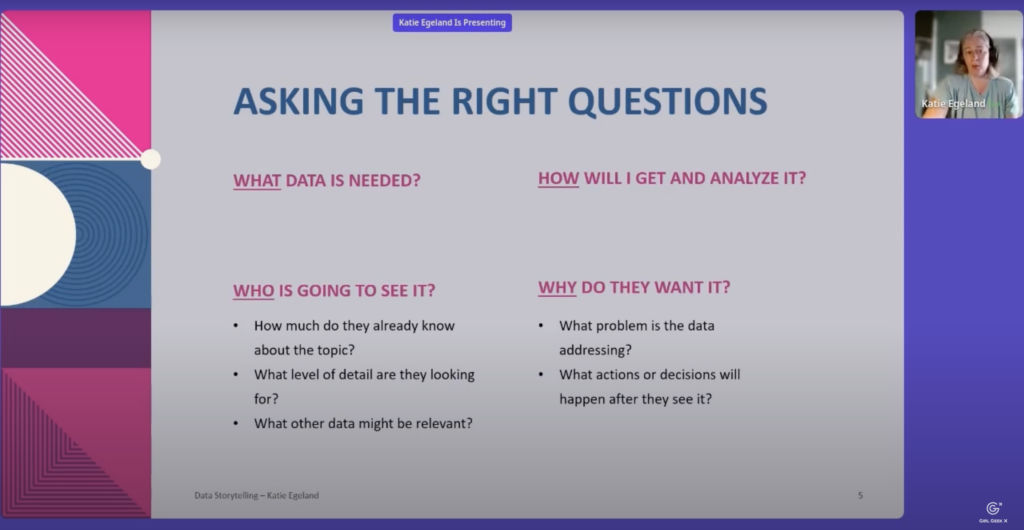
Katie Egeland: What questions does our stakeholder need answered? The other question is, how will I get it? How will I analyze it? Where do I need to go to find this data? What methodology do I need to use to analyze it? What code do I need? How do I clean the data up so that it’s usable? And often we, we stop here, and these two questions are really important to get started on any project, but if we can go a little beyond just these what and how questions, that’s where we can start to dig into that effective communication of our data. And in order to do that, we can think about a few other questions.
Katie Egeland: One is, who’s going to see it? This is, you know, really key to understanding who you’re communicating with knowing how much they already might know about the topic what level of detail they might be looking for. If you’re communicating something to an executive, they’re probably gonna be interested in much more high level insights and not so much detail as an engineering or marketing team.
Katie Egeland: And then also, when you think about who, you can think about what other data might be relevant, even if it’s not something that they directly ask for, if you have an understanding of the angle that they’re coming at things from and the other things that they’re involved in, you might be able to, to find other data to, to give them supplementary information that makes the data that they’ve asked for more, more useful to them.
Katie Egeland: Lastly, the most important question in my opinion, is why, why do they want this data? And this isn’t to ask, you know, oh, why do you want me to do this work? But it’s really to help you as the analyst understand what problem is that data addressing and what actions or decisions are going to come off of this data request. In order to think about all of these questions, I wanna run through a couple of examples of common scenarios that analyst finds themself in and talk about how we can apply this framework.
Katie Egeland: First, reports and dashboards, these are really common. Any analyst is gonna have fulfill many requests for these. And these can actually be a little tough because often when you get a request to create a report or a dashboard, the KPIs and the metrics are already set. You might just have a, you know, a list of, here’s everything I want on this dashboard, but even still asking some of these questions can help you do a better job.
Katie Egeland: Who uses the dashboard? Who’s going to be looking at this on a regular basis, especially if it’s a recurring report. Understanding again this executive report. Is this for troubleshooting some kind of issues or monitoring for issues? Wfhat metrics are actually going to drive action? A lot of times in requests like this, you get a long list of metrics, but which of those metrics are going to, when they change, actually alert someone and say, we need to make a change because this metric changed.
Katie Egeland: There’s also a few things you can do when you’re building these and thinking about visualizations. Using those visualizations wisely, not just putting a bunch of fancy looking charts on it. Charts can really help you drive actions.
Katie Egeland: My personal favorite is trended charts, so showing something over, over a mid or long period of time. Often we might put some type of metrics on a dashboard and look at week over week, quarter over quarter, year over year changes, but those don’t really tell the whole story. If you put a metric onto a trended chart, you might see a little bit of a dip in your week over week numbers. But when you look back over six months, you can see an overall upward trend. Having that better context gives you more information about where things are are trending.
Katie Egeland: Another trick I like to use on reports and dashboards is using conditional formatting. It’s pretty common to see things go up or they’re good. You see green things go down and they’re red. But going a little bit beyond just that if you understand what are the benchmarks or what’s the threshold of something changing where we actually need to take action, as opposed to, just any up or any down is green or red. If we can incorporate those into the reports, it makes it a lot more easier for the person consuming that to understand, oh, this is, you know, red in, in a negative way that I really need to look into it and change something as opposed to this is dipped, you know, some very small amount since last week.
Katie Egeland: And then another, my last tip on here is checking in with the requester of your reporter dashboard after a few weeks or a few months that they’ve been using it. Especially again, if it’s something that’s recurring or they’re referencing often, and you know, asking them, what parts of this are you using? Are there areas where you wish you had more information? Are there actually parts that you’re not really looking at all, even though you wanted to see those, those numbers initially, and having that conversation to understand what is actually useful for them.
Katie Egeland: Lastly, I think remembering that having numbers isn’t the goal. Sometimes when you make a request for reports and dashboards, your goal personally might be, well, I need to send those numbers to my boss because they’re asking for them. But the point isn’t just having the numbers. It might be for you to put in an email, but ultimately those numbers are, are going to be used for something and to, to drive some kind of action.
Katie Egeland: And so even if you’re not an analyst, even if you’re not the one building that dashboard, asking those questions of the people that you’re sending it to so you can really understand how they’re using those numbers and what type, what type of actions they’re driving. Deep dives. These are the other, I think major scenario for a lot of analysts. A deep dive is a bigger analysis project. Usually it’s gonna be questions that explain behavior or make some kind of recommendations to your business stakeholders. And these can often take many hours, many days even, you know, months to, to complete. There are a lot of effort and, you know, asking these questions is, is just as important, if not more.
Katie Egeland: Again, that question of who, who’s going to see this analysis, how are they going to use it? Understanding if it’s an explanatory or an exploratory analysis. Explanatory is looking at, you know, what happened, why did it happen, what what factors contributed to it? Exploratory is looking at where there’s opportunities what potential solutions might be in making those recommendations and understanding the di the difference in what’s being asked.
Katie Egeland: Another big one for me is understanding if your requesters already have a hypothesis. Sometimes when you get a deep dive request, the people asking it might already have a hunch of why they think something is happening or, or where things are trending. And if you know what their kind of hypothesis is in advance, it’s not. You can tailor your analysis and cherry pick and, you know, just build something to support it. But if you, for instance, see something that might be contradictory to the assumptions that they have, you can anticipate the questions they might have and know that there’s going to be potentially additional skepticism if what you’re showing goes against what they thought was going to be the case. And then again, always connecting us back to what decision or what course of action is this deep dive going to to help influence.
Katie Egeland: Sometimes you might be in a situation where people just wanna know, know more about a topic, but it’s not quite clear what action might come off of it, given that these deep dives can take such a long time really pushing on what are the outcomes, you know, that we can expect from this and, and how might we take this information and use it after it’s finished When you’re putting together deep dives, there’s a few things I think are really important.
Katie Egeland: One of those is starting with a summary of your key takeaways. I like to say that spoilers are good. You shouldn’t hide hide your takeaways at the end. It can be tempting as you’re building a story to, you know, start with, here’s the question, here’s how we investigated it and, and wait till the end to reveal your, your answers to those.
Katie Egeland: But if you start with your key takeaways right up front, you really hook your audience, you get them engaged, you, they know where you’re heading and they’re gonna be more interested in understanding how you got there and how you’re proving your points. Also including context where you need to. And this can be as simple as just taking screenshots, providing in explanations of a particular feature or experience. Even if you’re presenting to people who are quite familiar with, with the product you’re talking about, they may not be completely familiar with the exact feature or nuance that you’re, that you’re covering.
Katie Egeland: And making sure you have that context so both they can understand it and you understand it, them yourself is really important. Lastly, using the appendix to tailor your content to different audiences. If you produce a presentation that has 30 slides, depending on who you’re presenting to, you may not need all of those slides. For every, every audience I mentioned earlier, executives, they’re usually not gonna be interested in really long detailed presentations. They’re gonna say, what’s the key takeaways? What do I really need to know? If they have additional questions, you can pull those things from your appendix. But being really mindful of who you’re presenting to and how to use a time wisely when you have with them.
Katie Egeland: And then I think engaging, asking questions when you’re on the receiving end of a deep dive is really important. Nothing’s worse for an analyst to spend many, many hours putting something together and kind of get nothing back from the people they present it to. But when you’re asking those questions, making sure you’re, you’re thinking about them and curating them a little bit for yourself and saying, okay, if wanna know more about this, how is that going to help me in my job? How is that going to help me take some kind of action in the future to avoid creating a lot of extra work of kind of nice to know questions that might be interesting but might not actually have a lot of value in the end.
Katie Egeland: What I want you to take away from this is that the key to communicating anything is making it resonate with your audience. And if you can make it resonate, it helps drive action. And in order to do that, we want to, you know, again, think about these, these four questions that I’ve been talking about. One of them is the what metrics actually connect to actions? What are the key takeaways? Not hiding those, making sure they’re really clear upfront because they’re more important than the actual numbers that support them.
Katie Egeland: The question of how providing context, providing the right level of detail depending on, on who you’re showing this to. And using visualizations with a purpose and as a tool to help people understand what action they should take. That question of who understanding who your audience is, working hard to curate what you’re presenting or showing to them, to their needs, their level of expertise and the actions that they can actually take themselves. And again, again, for me, the most important question is why asking questions. What it is you’re, what it is you’re trying to, to communicate. What’s the actual purpose of, of the analysis and remembering that the point isn’t just the numbers, it’s the action that comes off of them.
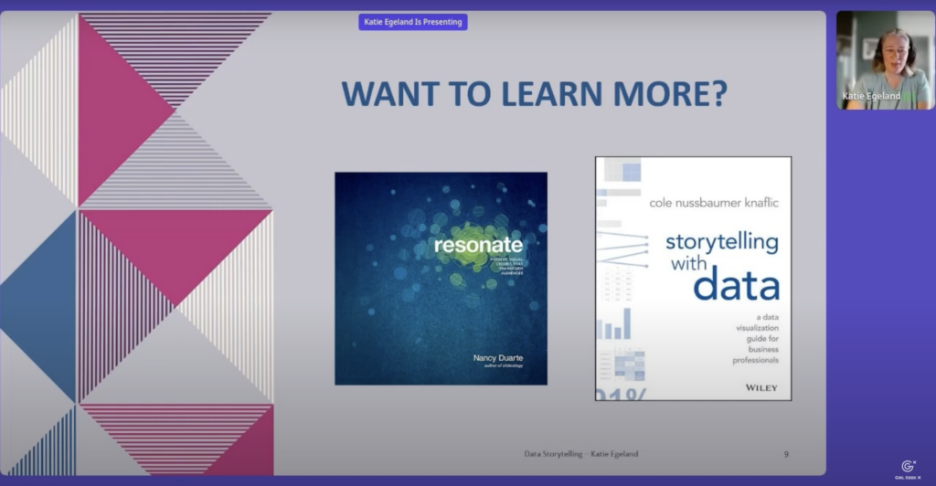
Katie Egeland: Now, I didn’t come up with all of this myself. This comes of course from many years of experience pulling data and presenting it and communicating it to people. But there’s a few resources I wanted to highlight here for you. One is a book called “Resonate” by Nancy Duarte. And she has many books about different styles of presentations. Some of them are data focused. “Resonate” is actually not about data at all. It’s really about visual storytelling and how to connect with your audience and break down your idea and what you’re trying to communicate and structure a story so that it really resonates with the people you’re talking to. The other one I really love is “Storytelling with Data” by Cole Nussbaumer, Netflix. And this is a little bit more straightforward data storytelling. It includes great tips for in improving your data visualizations, making them clear, making the action clear with what you’re trying to communicate, and also the importance of including context and making sure your audience understands that.
Katie Egeland: And once again, I’m Katie. If you have questions or you want to chat about data, storytelling and communication, feel free to hit me up on and thank you very much.
Sukrutha Bhadouria: Thank you Katie. People have so many amazing comments for you. We talk and even the reference to the book, the Storytelling with Data book being the best <laugh> book they have read, it’s really
Katie Egeland: Good. Yes.
Sukrutha Bhadouria: Yeah. Some people have shared their stories in the comments as well, so when you get the chance to take a look… Yeah. Well I wanna thank everybody for attending this session. It was very insightful. So thank you so much Katie, and thank you for taking time out on a workday, busy workday to have great Women’s Day with us.
Katie Egeland: Thank you everyone. Appreciate it.
Like what you see here? Our mission-aligned Girl Geek X partners are hiring!
- Check out open jobs at our trusted partner companies.
- Watch all ELEVATE 2023 conference video replays!
- Does your company want to sponsor a Girl Geek Dinner? Talk to us!
